NHL Jerseys Ranked
Photo Credit: NHL.com
December 3, 2021
The National Hockey League has some of the best uniforms in North American sports. Some teams’ jerseys go back almost a century and continue to shine as the best in the league. From classic to brand new, the colors and logos always catch eyes.
Having started watching hockey more and moreover the last several years, I’ve already seen so many great jerseys come and go. Since there are so many great hockey uniforms, and having seen plenty of ranking lists myself, I wanted to make my own. As a disclaimer, I’m neither a hockey expert nor a fashion designer.
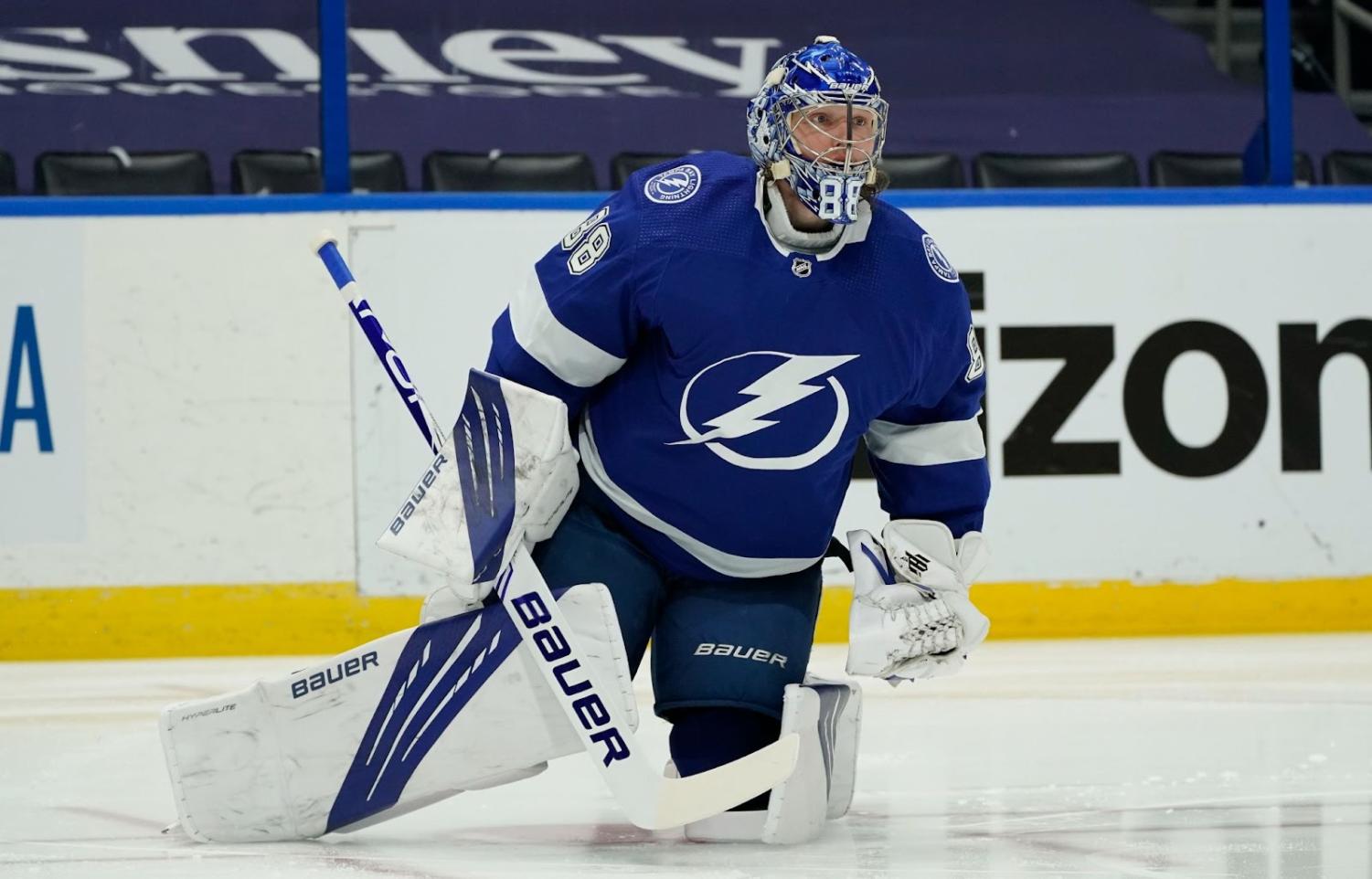
32 – Tampa Bay Lightning
As I said before, the NHL has some of the best jerseys out there, but someone had to be last, and that’s Tampa Bay. I don’t particularly dislike their uniform, but it lacks originality. Other teams that pull off the two-color scheme have been around much longer, leaving the Lightning with little to make their jersey special. Kudos to them, though, as their performance is stellar. Just not their jerseys.
31 – Washington Capitals
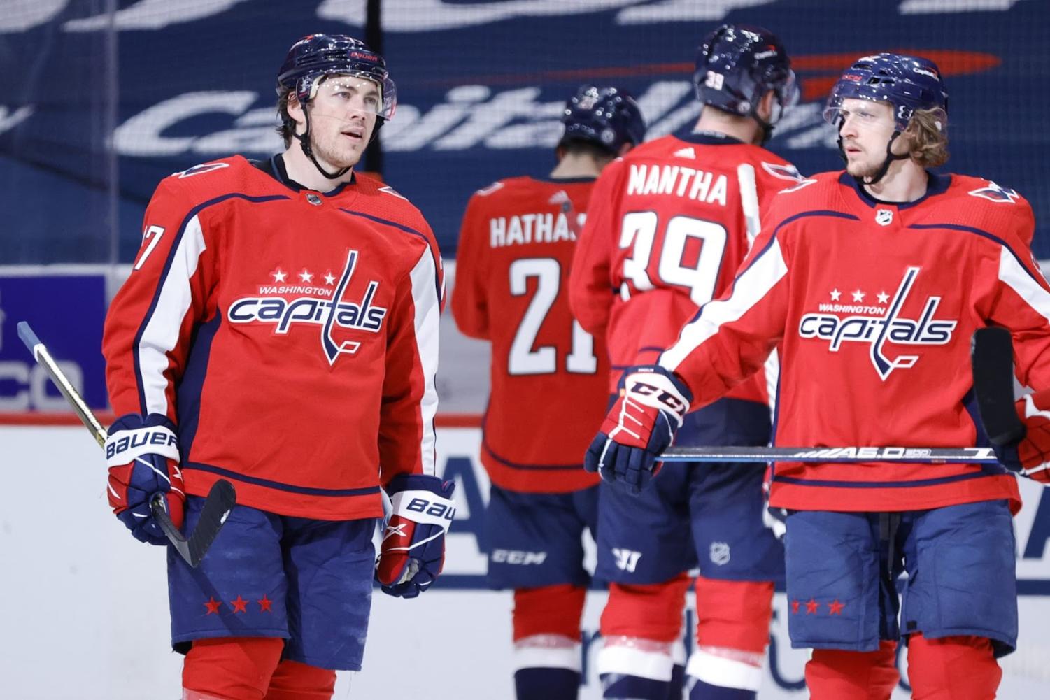
The Capitals’ jerseys aren’t bad, but they’re far from my favorites. The logo is primarily at fault. It’s simply the name of the team with a hockey stick worked into the “t.” The Capitals have a lot of potential for a better logo. Personally, I’d love to see the Screaming Eagle make a comeback.
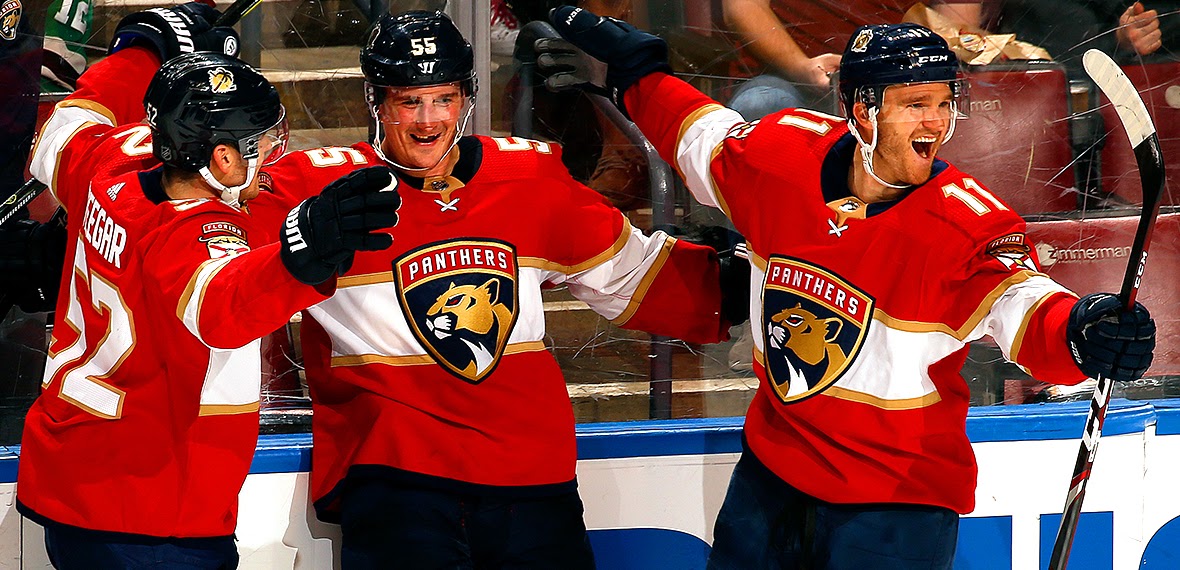
30 – Florida Panthers
Sorry, Florida. Neither of your teams ranked above the bottom 3. I prefer jerseys with stripes around the waist, but I don’t mind ones with the bands around the chest. With Florida, however, this stripe ends on the side of the jersey, leaving an unfinished look. Plus, the Panthers are another team that once had a much better logo, the Leaping Panther.
29 – Columbus Blue Jackets
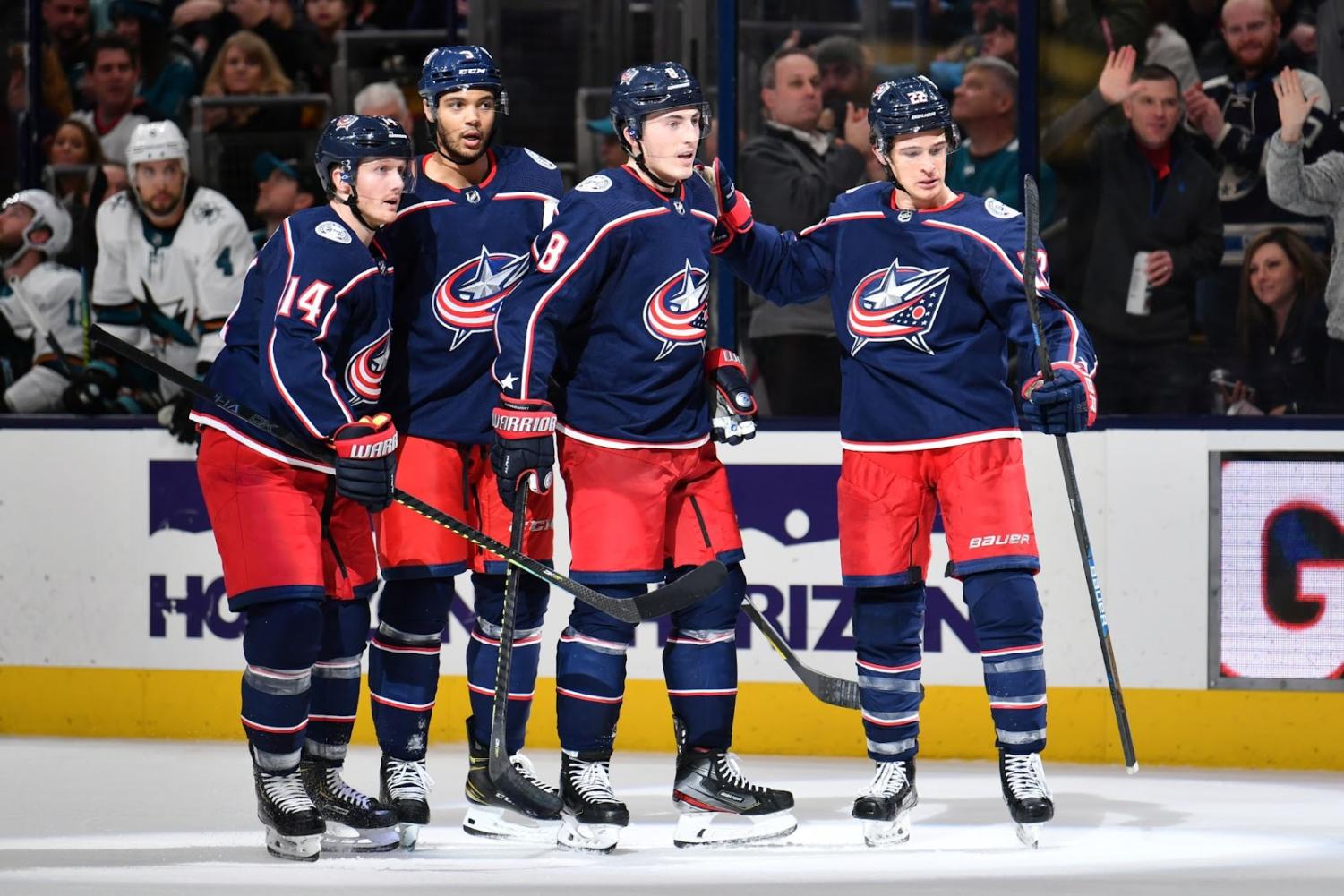
Columbus is another team with lines of color laid vertically on their sleeves. It’s still not my favorite look. They’re also the fourth, and most recent, team in the NHL to represent the red, white, and blue. The logo is far from the best in the league, but at least it’s not just their name. The Ohio state flag is a nice touch, too.
28 – Vancouver Canucks
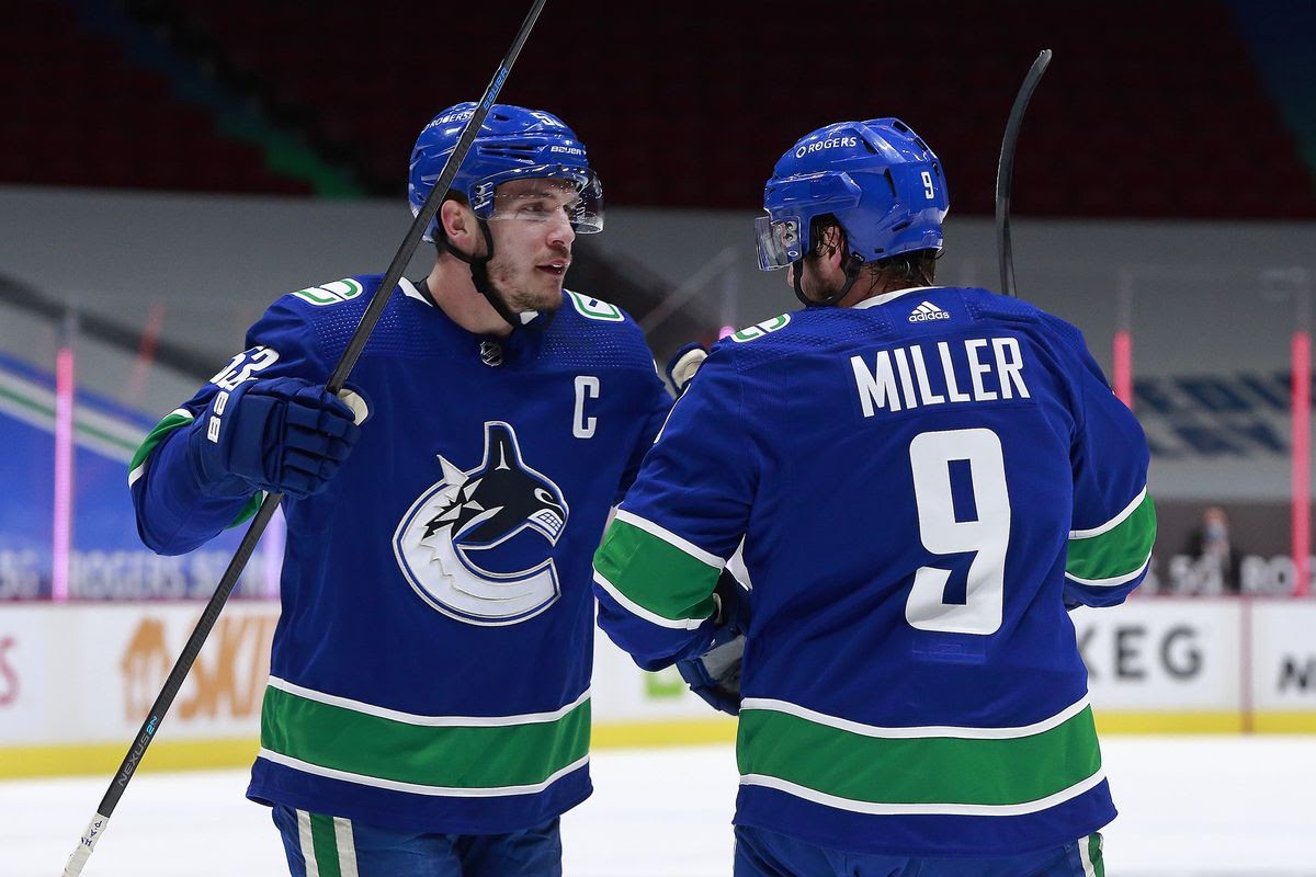
The Canucks’ jerseys were my favorite in the league when I was younger, but since then the admiration has worn off. I don’t love the green and blue combo, and the logo doesn’t do much to make up for it. It’d be a pretty big change, but I wouldn’t mind seeing the old Flying Skate jerseys make a comeback. The yellow, red, and black looked great together.
27 – Carolina Hurricanes
The Canes have a good logo, and the colors aren’t bad. The Devils definitely wear the red-white-and-black better, though. My biggest critique of their jersey is no fault of their own either. Instead, it has to do with their history. The Hurricanes were once the Hartford Whalers, and they have yet to top the previous team’s jerseys.

26 – Anaheim Ducks
The Ducks are yet another team with a current logo that doesn’t live up to

their previous ones. The Ducks’ old logo is almost unanimously considered better than the current duck-foot “D”, with a duck-billed hockey mask in front of two crossed sticks. The current colors are okay, but they’re arranged in a strange pattern.
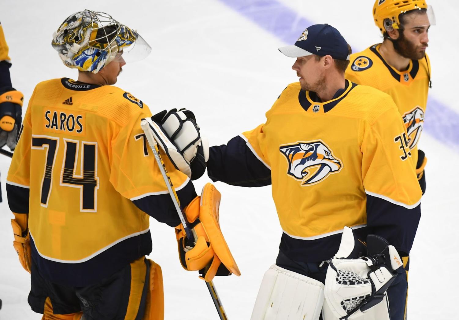
25 – Nashville Predators
The Predators have a great logo, but it gets drowned out by the yellow. Bright dominant colors on jerseys can be risky, and it doesn’t pay off for Nashville. Their complementary colors barely show, with a bit of navy on the sleeves and waist. The Preds get points for the guitar strings across their numbers, right at home in Music City.
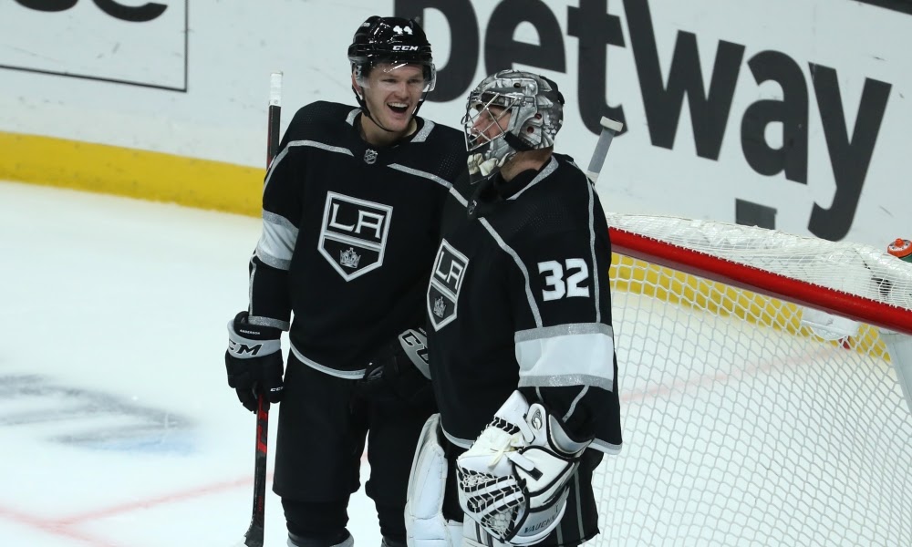
24 – Los Angeles Kings
The LA Kings have had some great jerseys and logos in the past, but their current uniform is mediocre in comparison. The black and white looks sharp, but the Pentagon doesn’t beat the Chevrolet-shaped Kings logo, my personal favorite. The Kings don’t have much left of their royal theme, with the purple and yellow colors gone from their home jerseys, and the crown left barely visible.
23 – Ottawa Senators
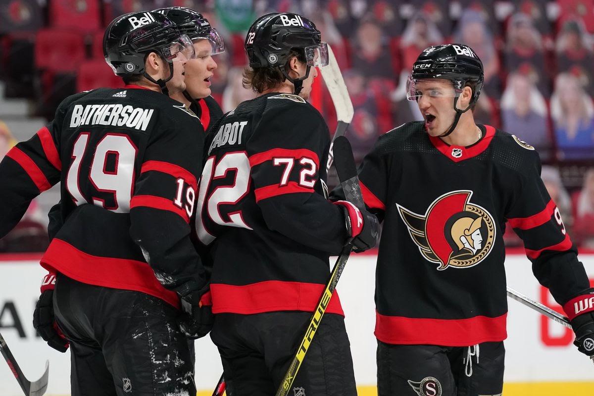
Ottawa has a decent current logo and color scheme. I like the logo, although it’s not really much better than the previous design. The red stripes on the arms and waist look good, but there isn’t much more going on with this jersey.
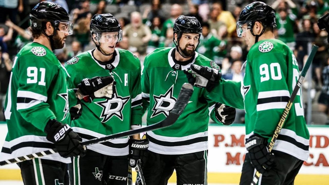
22 – Dallas Stars
The Stars’ logo on its own is alright, but the green jersey with black and white stripes make it stand out. The green is unique, as not many teams use it as their dominant color. The black and white sleeve stripes are pretty basic, but they do a good job of not letting the green overwhelm the rest of the uniform.
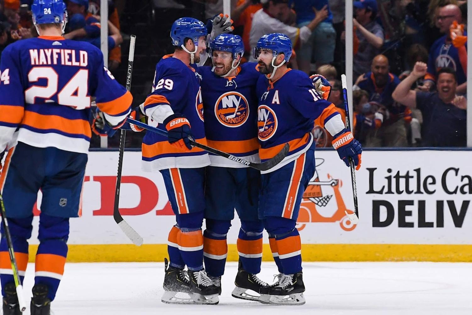
21 – New York Islanders
I really like the Islanders’ colors, and I think they’re well distributed on the jersey. The orange, blue, and white really make the uniform. However, the logo is not one of my favorites, with “NY Islanders” written in different colors laid over a silhouette of Long Island that looks like a piece of orange chicken.
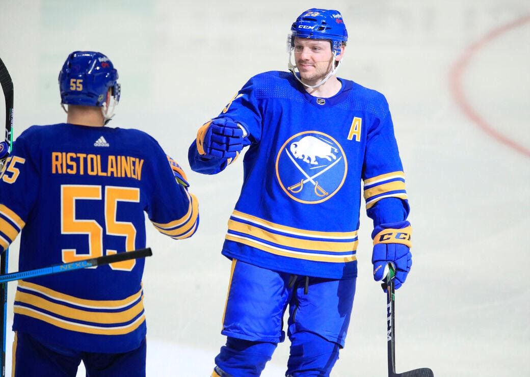
20 – Buffalo Sabres
The second of New York state’s three teams, the Buffalo Sabres have a current jersey that rivals all of their previous uniforms. The lighter blue looks just as good as their old navy blue, and the yellow stripes, names, and lettering looks great. I’m a fan of the logo as well, with a buffalo placed above two crossed sabers.
19 – Edmonton Oilers
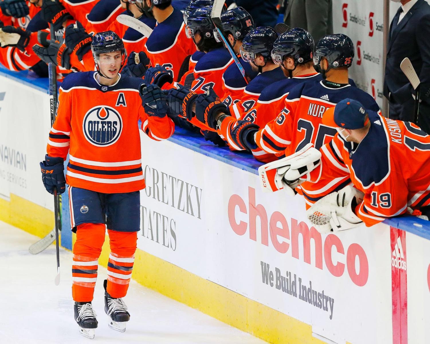
The Oilers’ current jerseys look good, with all the colors working, looking great together. The swap from navy to orange as the dominant color is questionable, however, as the previous design is arguably better. Either way, the jersey isn’t ruined, and the oil-drip logo looks as cool as ever.
18 – San Jose Sharks
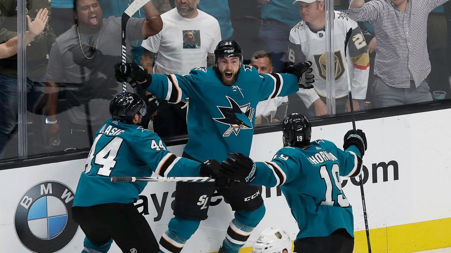
The Sharks have one of my favorite logos in the league. The chomping shark looks mean and sharp, and the colors are great. If a few adjustments were made, like more of the orange and a white waist stripe, this jersey could be one of the best in the league.
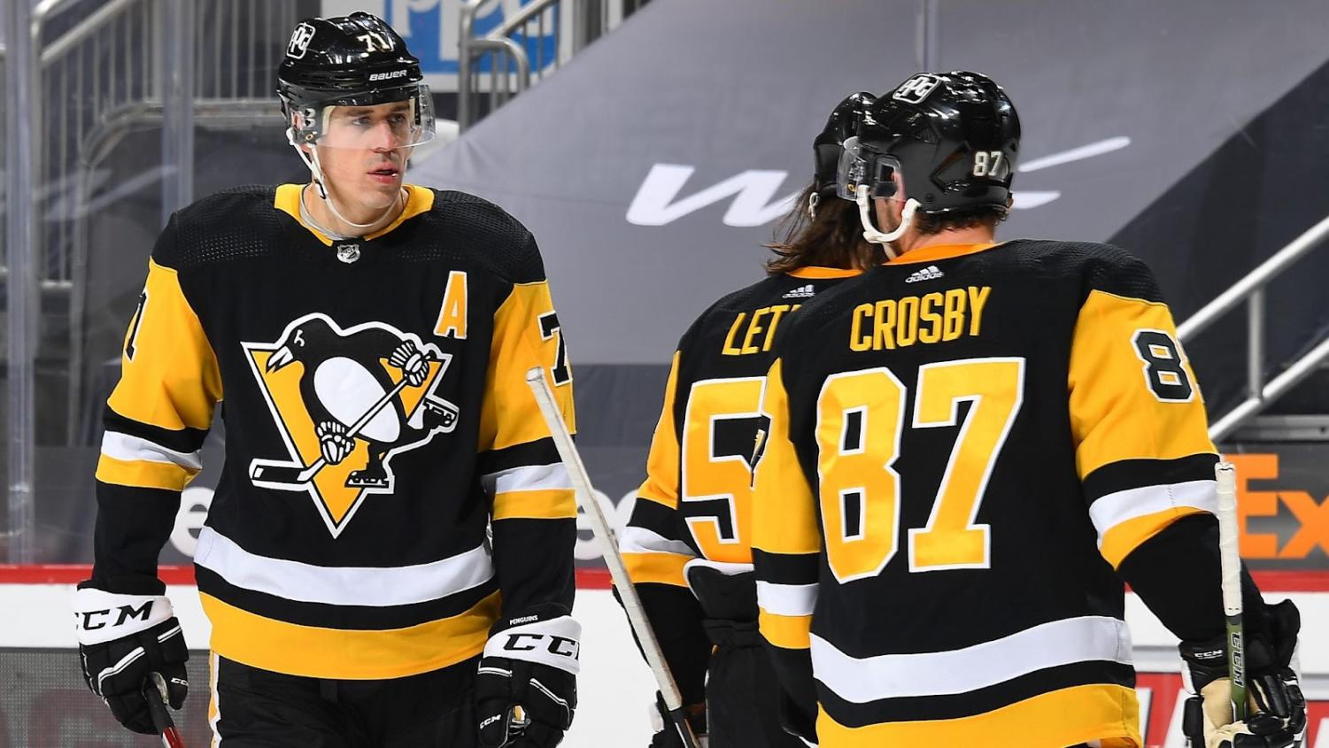
17 – Pittsburgh Penguins
The Penguins have a very clean-looking jersey. The logo is good, and I like how the colors match with the Steelers. In my opinion, it’s also a huge improvement from the jerseys they wore earlier in the 2010s. My biggest issue with their jersey, though, is the colors themselves. They’re too similar to the Bruins, who wear the black and gold much better. Still, I’d rather this than the beige/yellow they used to wear.
16 – New Jersey Devils

The Devils have a good-looking jersey and logo that comes together well. The “NJ” with devil horns is smooth, and the black shoulders are a good touch. I would rank them higher if there was a waist or chest stripe, but the red doesn’t come off as too much without it.
15 – Arizona Coyotes
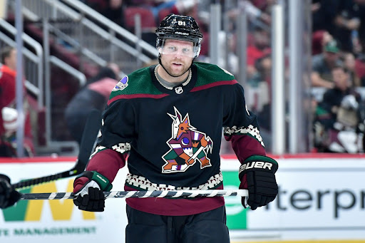
In all honesty, I’m not really sure what to make of Arizona’s new home jersey. There is so much going on, and the colors alone are a lot to take in. Not to mention the sleeves, waist, or logo. I don’t hate it, but I don’t love it, so I will leave it in the middle of the pack. If one thing is for certain, it’s that the Kachina jersey is the most unique in the league.
14 – Toronto Maple Leafs
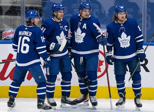
The Leafs have a very similar jersey to the last place Lightning, having a blue and white pattern with the former color being the dominant one. The Leafs’ jersey looks sharper, and not to mention is about sixty years older. The Leafs get bonus points for being classics, but their basic jerseys don’t get them much further.
13 – Chicago Blackhawks
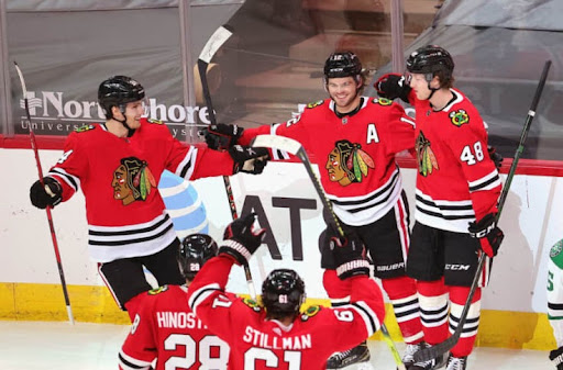
This one is a stray pick, as numerous lists rank Chicago’s jersey among the best in all sports, all time, like The Score. For me, however, I have a hard time putting it at the top. The primary logo looks great, but the shoulder insignia isn’t nearly as good. The shoulder and waist stripes are pretty basic, too. I cannot deny that the jersey is a classic icon of a great franchise, but it isn’t the best looking out of all the current home uniforms.
12 – Philadelphia Flyers

Another classic jersey, the Flyers have been wearing the orange, white, and black for a long time. It’s a great set of colors, but I’m not into how it was executed. The plain white band around the waist is okay, the arm stripes are a little better, but the names aren’t great. It looks like someone wrote a player’s name wrong and had to go over it with white-out so they could get it right the second time.
11 – Seattle Kraken

The Kraken did a great job with their inaugural home jersey. I love the colors, and the logo is just as good. The red, navy, and ice blue look great, but I can’t help but feel that a few more strips of red could be an improvement. Either way, the Kraken have definitely started themselves off with a solid uniform in Seattle.
10 – Vegas Golden Knights
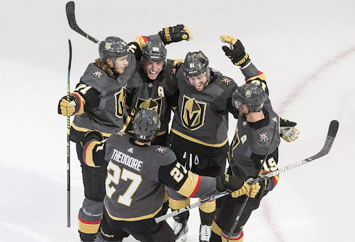
Ranking 10th out of the top ten, the previously youngest NHL team, prior to the Kraken, did even better on their first jersey. The logos are great, with the “V” Knights helmet as the primary and the coat of arms on the shoulder. The colors are new and look sharp, with the two shades of grey, and the gold and red stripes. It gives the feel of the desert, too, fitting right in with the Las Vegas environment.
9 – Colorado Avalanche
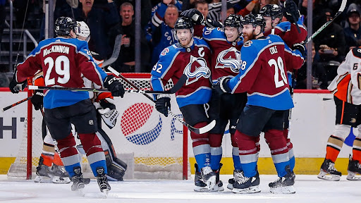
I’ve always loved the Avalanche’s colors, and they might be my favorite in the league. The maroon, cool blue, and white are perfect for a Colorado team named after snow. The shoulder patches are just as good, with the Colorado “C” in the team’s colors. The primary logo is good, but not the greatest, especially compared to the old Nordiques logo that was replaced by the Avs. Still, this is one of my favorite uniforms in the league.
8 – Montreal Canadiens

Rivalry aside, the Canadiens have a great, classic jersey. The middle band of color is done well, wrapping all the way around the numbers. The logo is a hockey icon of the most successful NHL team ever, with one of the richest histories. They’re the third team on the list to use a red, white, and blue color scheme, but are by far the oldest to do so. Not the best, though.
7 – Winnipeg Jets
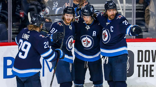
The Jets’ logo is one of my favorites out there, with the jet laid over the maple leaf on a blue and white circle. The “Jets” part comes from the original owner being a NY Jets fan, but fortunately, Winnipeg has had more success than their namesake in recent years. The two shades of blue with the white stripes are great, and make the jersey overall look clean and ice cold.
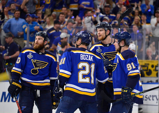
6 – St. Louis Blues
No matter the jersey design, I would automatically lean towards the Blues’ uniforms because of their logo. The music note with a wing is great and derives from the song “St. Louis Blues” by W.C. Handy. Luckily for the Blues, they aced more than just their logo. The colors are great and look even better altogether.
5 – Detroit Red Wings

Detroit’s jersey is the definition of timeless. It’s been virtually the same from its creation in 1932, to the Gordie Howe era, to Ferris Bueller’s Day Off, all the way to today. Some of the best players in NHL history have worn the uniform, making it even more iconic. It’s my favorite of the two-color jerseys, with the red and white combination really shining on the ice. Their logo is another great one, being from Motor City after all.
4 – Calgary Flames

The Calgary Flames made an excellent choice by returning to their original jerseys. The flaming white “C” is great, as are the color combinations. The yellow, red, and white make it one of the brightest jerseys in the league, perfect for a team named the Flames. The stripes are, in my opinion, perfectly placed on the waist and sleeves, and I love how some red is placed in between.
3 – New York Rangers
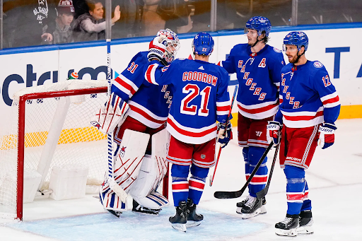
The Rangers’ jerseys have been consistently improved until the point where they’re firmly in my Top 3 of all uniforms. The 3D jersey numbers and names are my favorite design in the league. The front logo is decent, and I won’t knock it for being just their name since it’s such an old symbol. The Rangers are also my favorite jersey to use the red, white, and blue theme in their uniform. All the colors are balanced, and the royal blue is a great dominant shade.
2 – Minnesota Wild
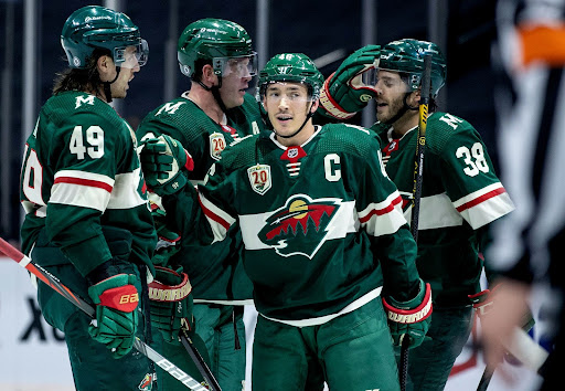
The Minnesota Wild have possibly the best logo in the league. The Animal head made up of a wilderness landscape is fantastic. The rest of the jersey is just as great, with the green, red, and off-white. The “M”s on the shoulder are simple, but that’s the purpose of a secondary logo. I’m a fan of logos and jerseys that are inspired by a team’s home city/state, and Minnesota has exactly that.
1 – Boston Bruins
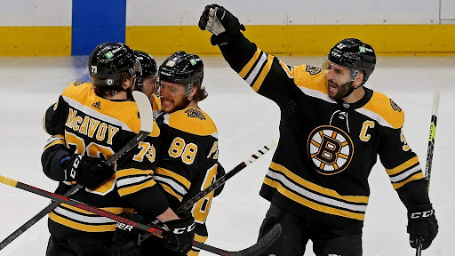
I’d be proud if my bias as a Bruins fan hasn’t shown until now, but it would be hard to hide after this one. The Boston Bruins’ jerseys are frequently ranked as one of the best uniforms in the league, but I place them right at the top. The Bruins’ jerseys are just as classic as those of the oldest teams in the league, being the first NHL team from the U.S. The Spiked B is a great symbol of Boston and hockey itself, as is the notorious black and gold color pattern.
That’s the list. I hope it’s not atrocious, and I’d love to hear other people’s favorites. This kind of list is purely subjective, so everyone will have their own preferences. I’ll stand by the Bruins as No. 1, but I think a case could be made for most of these jerseys to be the best or even the worst. Regardless, the NHL definitely has my personal favorite uniforms in all sports.
JCF • Dec 11, 2021 at 9:06 pm
Nice piece Jack. I look forward to the follow up on top 10 all time jerseys or sweaters as they were originally referred in your opinion. Lots of list out there to research. The Whalers jerseys as you mention typical can be found in the top 5. Quebec in the top 10. Highest Bruins jersey I could find on a list landed at number 9. 2016-2017 winter classic jersey. Current bruins jersey sits in the mid 20’s. Not bad for all time top “sweaters” I guess