New Sign, Yay or Nay?
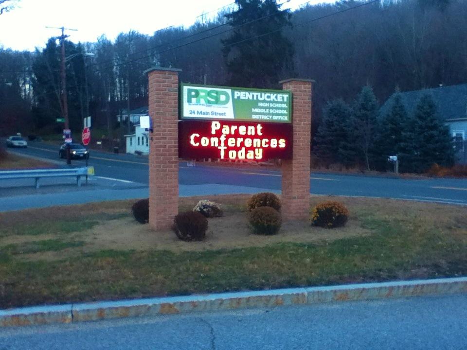
The new electric sign at Pentucket Regional High School has people, especially students and faculty, talking. Is the sign really that much better than the old?
The sign was generously donated by the classes of 2007, 2011, and 2013. The mason behind the construction was none other than Mr. Merrit, which many have claimed did a really fabulous job. Pentucket’s own Bobby Barry states, “I think the mason did a really good job”.
Apart from the masonry, many question whether or not the actual electric sign was worth it. Ben Smith, Pentucket Senior certainly does not think so. “The old sign out front had some historical value to the school. It went with the old rustic look of the school.” Further adding, “The new sign looks a little progressive for a school stuck in the 1950’s.
In a small survey of twenty students, the feelings about the new sign were essentially split, with 45% liking the new look, 55% disliking. The main comment were the muted appearance of the colors chosen, and its size. One parent, Jaco Sarkis claims, “It is incredibly bland. It is a step up, but it could use some life, like bushes or something.”
The benefit of the new sign is the ease at which messages can be changed and illuminated alerting students and faculty of upcoming events. Haverhill High School has a similar sign that is more substantial in size, and colorfully illuminated with school news and information constantly. Since the new Pentucket sign has been in operation it has only been illuminated for the few days following its startup.


Bobby Hallowell • Dec 12, 2013 at 6:58 am
The new sign is nice but the old one is what pentucket was all about
Emily • Dec 12, 2013 at 3:02 am
the sign looks kind of bland to be honest. the top part of the sign looks almost like a business card
Will Kopaciewicz • Dec 4, 2013 at 9:04 pm
Well I must say, I wish the sign was larger. I feel that the old sign was a good size and stuck out pretty well. Meanwhile, the sign now is small enough to the point where someone driving by may not even notice it. That being said, the masonry on it added a good look to it, it just seems to be missing something.
Brennan McGuirk • Dec 4, 2013 at 8:06 pm
I think that this article was very well-done. Many people have mixed feelings about the new sign and this article clearly states that.
Rebecca Torrisi • Dec 4, 2013 at 6:17 pm
This is a very interesting topic that I feel affects the school as a whole.